Tips for Sizing Photos for Publications

When sharing photos to be published on professional blogs and magazines, it's important to send high-quality images that meet the publication's specific requirements. While these requirements can vary from one publication to another, there are some general guidelines you can follow:

  1. Resolution: Photos should have a high resolution to ensure they look crisp and clear in print or on the web. A resolution of 300 dots per inch (DPI) is a common standard for print, while 72 DPI is typically used for web images.

  2. Image dimensions: The actual dimensions of the image will depend on the layout of the publication. Ask the magazine or blog for their specific size requirements. For web use, images are often measured in pixels (e.g., 1200 x 800 pixels), while print images may be specified in inches (e.g., 8" x 10").

  3. File format: Common image file formats for professional use include JPEG, TIFF, and PNG. JPEG is the most common format for web use, while TIFF is preferred for print due to its lossless compression and high quality. I usually save photos in JPEG when printing.

  4. Color mode: For print, use the CMYK color mode, which is optimized for the four-color printing process (Cyan, Magenta, Yellow, Black). For web use, use RGB color mode.

  5. File size: The file size should be large enough to meet the publication's requirements for resolution and print quality. However, it should not be excessively large, as this can cause issues with file transfer and storage. Typically, a high-resolution image will result in a larger file size.

  6. Compression and quality: When saving images in formats like JPEG, you can adjust the compression level to balance image quality and file size. Choose a high-quality setting to minimize compression artifacts, especially for print.

  7. Naming conventions: Use clear and descriptive file names, including your name, a brief description of the content, and possibly the publication's name or date. This makes it easier for editors to manage and find your images.

  8. Submission guidelines: Always follow the submission guidelines provided by the magazine or blog. They may have specific preferences for file formats, delivery methods, and other details.

  9. Metadata and captions: Include relevant metadata and captions with your images, especially if you're submitting them to a publication. This information can help editors understand the context and content of the images.

  10. Image release forms: If your photos feature recognizable individuals or private property, you may need to provide signed model or property release forms to protect the publication from legal issues.

It's crucial to communicate with the magazine or blog's editorial team and ask for their specific requirements and preferences. Different publications may have varying standards, and adhering to their guidelines will increase your chances of having your photos published in a professional manner.

Loading Your Photos On Instagram...Don't Do This

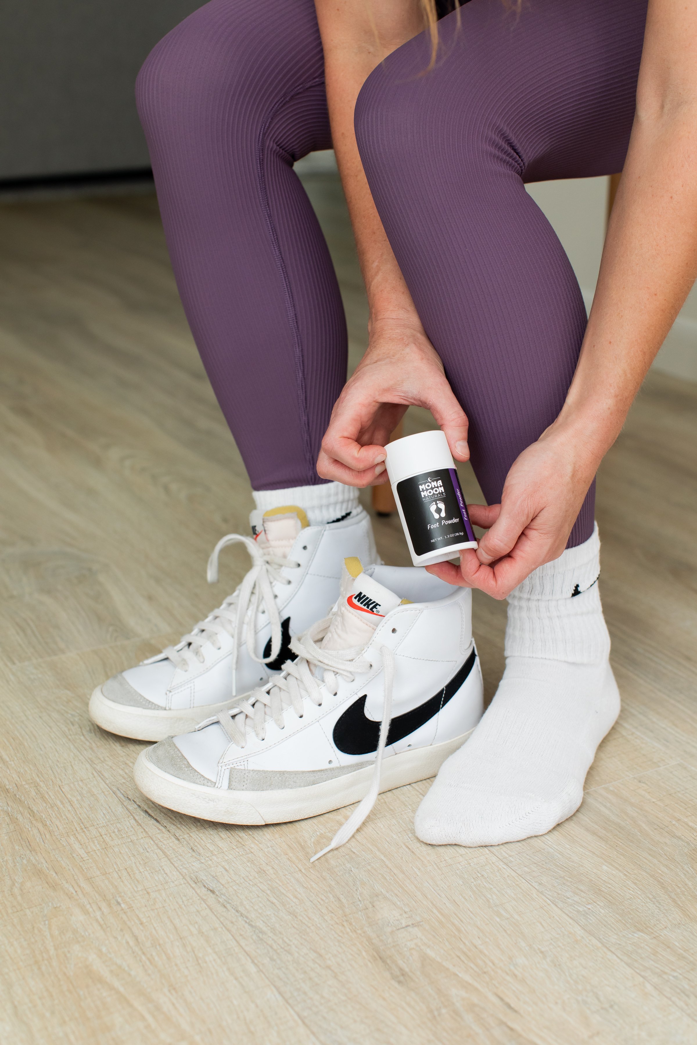
When you load photos on Instagram, make sure you do the photo justice. Don't cut off limbs and make the photo incomplete.

In my college photography classes, the composition rule my professor taught us when photographing portraits was this: do not cut off limbs in your photo. More specifically, don’t crop where the joints meet.

For example, wrist to forearm, elbow to upper arm, ankle to leg, and knee to upper leg. If you crop parts of the body, do it in the middle of the arm, or middle of the thigh for example.

Cropping at the joints leaves the body incomplete. It makes the brain wonder where the hand or foot are. However, if you crop in the middle of the torso instead of at the hips, or middle of the forearm and not the wrist, it helps the brain see the body complete, knowing there is more outside of the frame.

This one tip can either make or break your picture (in my professional opinion) when posting on Instagram.

Did you know you can use a rectangle crop instead of a square crop when posting on Instagram?

How to make a rectangle crop on Instagram:

  • Select the plus sign at the bottom in the middle.

  • Select the picture that you want to showcase. As you select the picture and Instagram pulls it up, it shows it in a square form.

  • For this picture I’m showing you in the video, the picture is a full body, head to toe photo, so we need a rectangle crop.

  • Select the right angle icon at the bottom left. This will give the photo a fuller crop.

  • The new composition still crops off the feet.

  • This can be corrected by gently sliding the image up with your finger. Did you know you can do that you?

That’s it!!

Next time you post, try this out. Even if you use Planoly or other third party planners for social media, you can still apply this technique.

If you have any follow up questions, feel free give me a call or email me.

Cropping Guide (1).jpg

What is a preset, and what does it do?

What is a preset, and what does it do?
⠀⠀⠀⠀⠀⠀⠀⠀⠀
To some, they are magical and life changing.
⠀⠀⠀⠀⠀⠀⠀⠀⠀
I for one am one of those people.😂
⠀⠀⠀⠀⠀⠀⠀⠀⠀
Every single day I edit photos on my computer or phone, I use presets to enhance my photographs.
⠀⠀⠀⠀⠀⠀⠀⠀⠀
A preset is a recipe of ingredients used to make a good photo look great. It’s ingredients consist of adjustments on exposure, contrast, cool or warm temperatures, green or pink tints, deep shadows, or bright backgrounds, luminance and hues, etc. My favorite presets to use are CC Mobile Presets.
⠀⠀⠀⠀⠀⠀⠀⠀⠀
Each preset works differently. Some are made to brighten a dark photo. While others focus on enhancing colors, increasing contrast and lowering the exposure.
⠀⠀⠀⠀⠀⠀⠀⠀⠀
Depending on how your photo was taken, will depend on which preset will look best for your final edit.
⠀⠀⠀⠀⠀⠀⠀⠀⠀
Adding a preset to a dark photo that was meant to bring back highlights (making highlights darker) would end up making the entire photo darker.
⠀⠀⠀⠀⠀⠀⠀⠀⠀
Or, using a bright preset (raising exposure) to an already bright photo, would make your photograph overexposed (too bright).
⠀⠀⠀⠀⠀⠀⠀⠀⠀
These are just a couple tips on using presets. Stick around and I’ll share more in the future or feel free to check out after/before photos at CC Mobile Presets on Instagram.
⠀⠀⠀⠀⠀⠀⠀⠀⠀
Do you have any questions about presets? Leave your questions in the comments section and I’ll dive deeper into them.

After editing the photo below, I went one step further to change up my creative game by flipping the photo.

Top photo: After, Bottom photo: before

Brand photography by Clovis, NM photographer Cristy Cross_0009.jpg

Left: After, Right: Before

Brand photography by Clovis, NM photographer Cristy Cross_0010.jpg

Do You Want To Look Good On Social Media?

Planning for social media is a battle when you don’t have a picture to post. Am I right?
⠀⠀⠀⠀⠀⠀⠀⠀⠀
Let me help you out! Grab your five free organic and nature inspired stock photos to plan out your social media content. Click the photo below and enjoy!

How can I use stock photos?

  • Instagram and Facebook posts

  • Newsletters

  • Slideshow presentation

  • Ebook

  • iPhone Wallpaper

  • Instastories background with quote

  • Load in Canva and add text box